Blog
How to Create a Research Location Map in Excel: District, Province, and Country Maps
Creating a research location map is an important part of any research report or scientific article. A research location map helps readers understand where the study was conducted, the geographical coverage, and the area’s position. A clear visualization of the research site enhances and strengthens the presentation of research findings, especially when the study involves comparing conditions across different regions.
For example, suppose a researcher conducted a study in two districts located in the Province of West Nusa Tenggara, Indonesia. The researcher can display a map of West Nusa Tenggara Province to show where the research took place, in East Lombok and Central Lombok districts, for instance. With such a map, readers from other regions or even from abroad can easily understand the geographical setting of the research.
Interestingly, you can create a simple research location map using Microsoft Excel. Excel now provides a powerful Map Chart feature that can be used for visualizing research areas from the national level down to provinces and districts. In this article, Kanda Data will show you how to create maps in Excel. Stay tuned and read until the last paragraph!
How to Create a Country Map Showing the Research Location Among Other Countries
To begin, I’ll walk you through how to create a country-level map of your research location. Let’s continue the previous example, creating a map of Indonesia among other countries in the world.
First, open Microsoft Excel (version 2019 or later), or use Microsoft 365. Then, prepare a table like the one below:
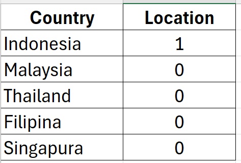
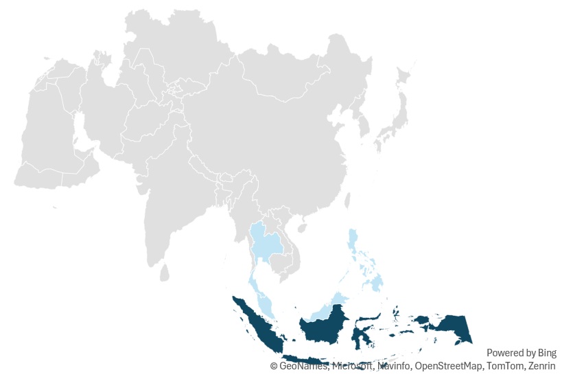
Next, highlight all the data, and go to the menu Insert → Maps → Filled Map. Excel will display a world map, and Indonesia will appear in a different color because its value is set to “1”. You can adjust the color by right-clicking → Format Data Series → Fill & Line → Solid Fill. The resulting research location map can be seen in the image below:
How to Create a Province Map Within a Country Map
After successfully creating the Indonesia map among other world countries, the next step is to create a province-level map showing where the research was conducted. Based on the previous example, the research took place in the Province of West Nusa Tenggara, Indonesia. Therefore, we’ll now create a map showing that province among other Indonesian provinces.
First, prepare the data to create the West Nusa Tenggara province map in Excel. Make a simple table like the one below:
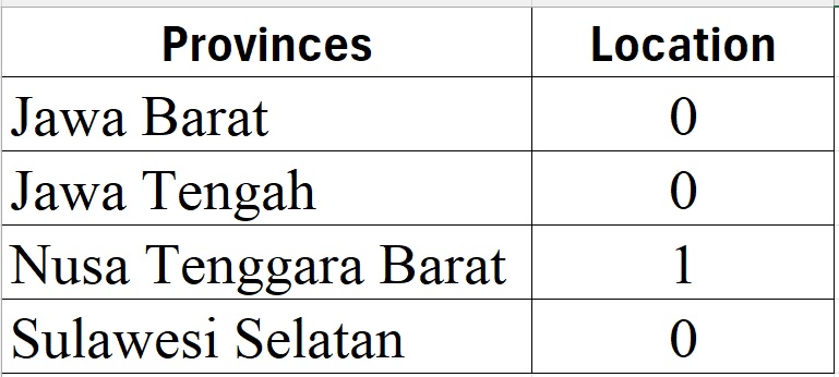
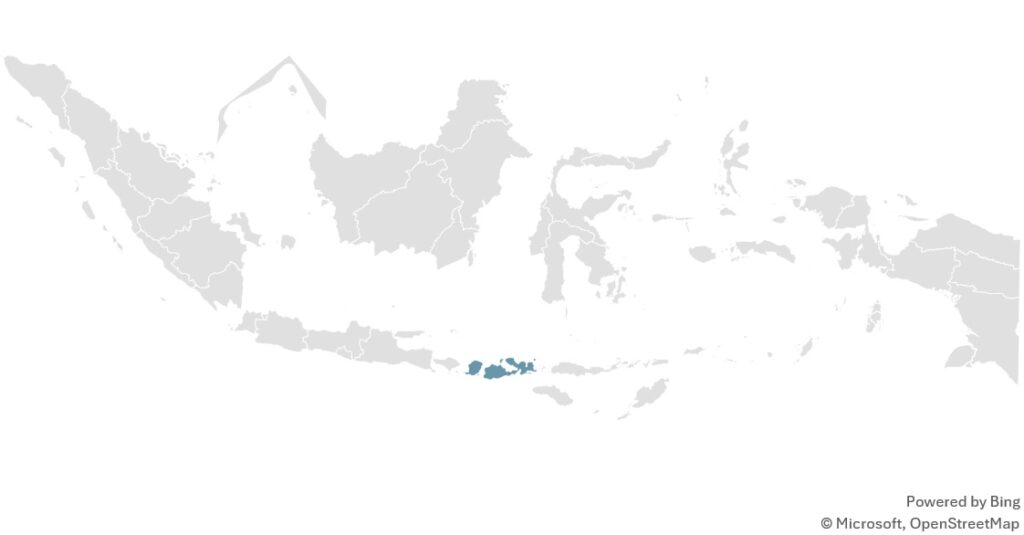
Then, just like before, highlight the table → Insert → Maps → Filled Map. Excel will automatically display the map of Indonesia divided by provinces. The province where the research was conducted (West Nusa Tenggara) will stand out in a different color:
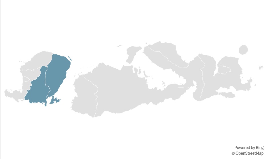
How to Create a District Map Within a Province Map
The final stage is to create a district-level map, especially if your research involves several districts within one province. For example, the study was conducted in East Lombok and Central Lombok Districts. Now, let’s create that map. Prepare your data as follows:
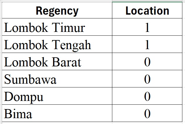
Then, highlight the table → Insert → Maps → Filled Map. Excel will generate the research area map showing East Lombok and Central Lombok, each appearing in different colors:
Conclusion
Creating a research location map in Excel is a fast and efficient way to visualize your study area. With just simple data preparation and the Filled Map feature, you can easily create maps at the country, province, and district levels.
A well-designed map not only clarifies the research location but also adds strong visual value to your report, journal article, or presentation. That’s all for this tutorial from Kanda Data—hope you find it useful and insightful. Stay tuned for our next article update!