Blog
How to Test Linearity Assumption in Linear Regression using Scatter Plot
The linearity test is one of the assumption tests in linear regression using the ordinary least square (OLS) method. The objective of the linearity test is to determine whether the distribution of the data of the dependent variable and the independent variable forms a linear line pattern or not?
The linearity assumption must be fulfilled because the regression used is linear regression. In the linearity assumption test in linear regression, you test the distribution of the data between the dependent variable and the independent variable.
On this occasion, Kanda Data will discuss testing linearity in linear regression using a scatter plot graph. I will use an example of a mini-research case to test its linearity.
Linearity Test on Linear Regression using Mini Research
The objective of our mini-research is to determine the effect of income and population on rice consumption. In the mini-research, income and population were used as independent variables. Rice consumption is used as the dependent variable.
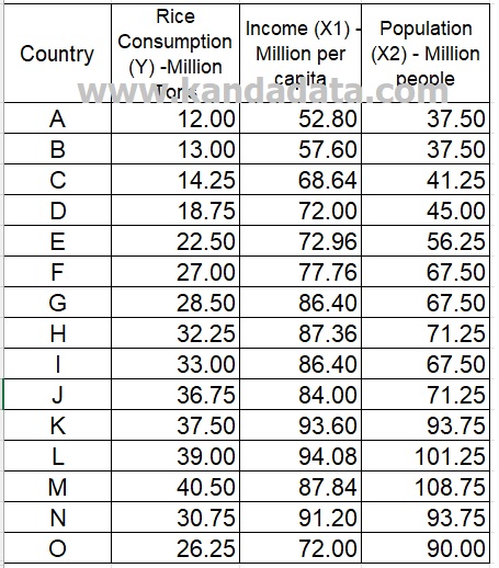
The data we use for exercise can be seen in the table below:
How to test for linearity using scatter plot in STATA
In STATA, you will find several icons. Then you select the table icon with a pencil drawing. In the next step, you input all the data I have conveyed above. Data from the rice consumption variable (Y) is inputted in the first column, then data from the income (X1) and population (X2) variables are entered in the 2nd column and 3rd column.
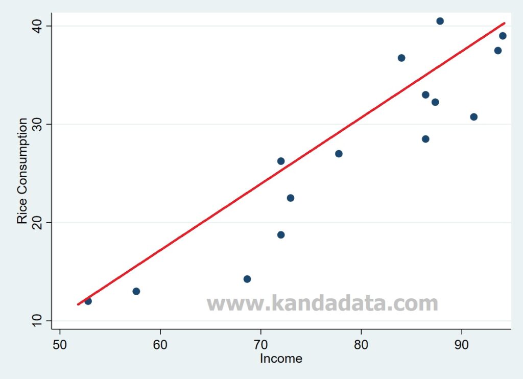
To test linearity in linear regression, I will use a scatter plot graph. In creating a scatter plot graph between rice consumption (Y) and income (X1), you type in the command in STATA as follows:
twoway (scatter Y X1)
Next, you can press enter, and the scatter plot results of the linearity test between rice consumption (Y) and income (X1) can be seen below:
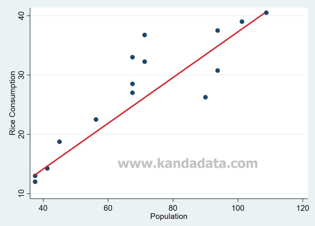
In creating a scatter plot graph between rice consumption (Y) and population (X2), type in the command in STATA as follows:
twoway (scatter Y X2)
You can press enter, and the scatter plot results of the linearity test between rice consumption (Y), and population (X2) can be seen below:
Interpreting the Output
Based on the scatter plot graph for the rice consumption variable with the income variable, we can see that the data distribution forms a linear trend line. The linear line is formed from the bottom left to the top right (positive linear line).
The same thing also happens for the scatter plot graph for the rice consumption variable with the population variable. We can see that the data distribution forms a positive linear trend.
Based on the results of the linearity test using a scatter plot, we can conclude that the regression model has fulfilled the linearity assumption. Therefore, it is correct that we choose to use linear regression. To deepen your understanding of linear regression and how to test assumptions like linearity using scatter plots, I recommend the book Regression Analysis: An Intuitive Guide for Using and Interpreting Linear Models.
Well, that’s the topic of our discussion this time. Hopefully, it will be useful for all of you. See you in the following article.