
In the world of agricultural research and economic analysis, we often deal with large datasets containing various commodities, regions, and production figures. Analyzing this data manually is not only time-consuming but also prone to errors. This is where the Excel Pivot Table becomes an indispensable tool.
A Pivot Table allows you to summarize thousands of rows of data into a concise, professional report in just a few clicks. Whether you are a researcher at a national agency or a student working on an econometrics project, mastering this feature will significantly enhance your data processing workflow.
Why Use Pivot Tables for Research?
Before we dive into the tutorial, it is important to understand the theoretical benefit of pivot tables: Data Aggregation. In statistics, aggregation helps us identify trends and patterns that are invisible in raw data. By grouping variables like “Region” and “Commodity,” we can perform descriptive statistical analysis efficiently.
Step-by-Step Tutorial: Analyzing Agricultural Production
Let’s use a practical example. Suppose we have the following dataset regarding crop production across different districts:
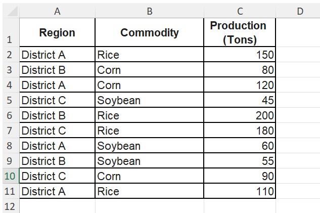
Step 1: Prepare Your Data Source
Ensure your data is organized in a tabular format with clear headers (Region, Commodity, Production). Make sure there are no empty rows or columns within the dataset.
Step 2: Insert the Pivot Table
- Select any cell within your data range.
- Go to the Insert tab on the Excel Ribbon.
- Click on PivotTable.
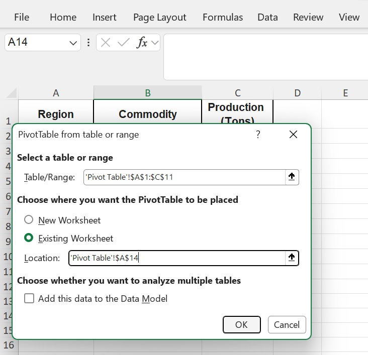
- A dialog box will appear. Ensure the “Table/Range” covers your entire dataset, then choose “New Worksheet” for the location of your report. Click OK.
Step 3: Configuring the Pivot Table Fields
Now, you will see the PivotTable Fields pane on the right side. Drag and drop the headers into the following areas:
- Rows: Drag Region here. This will list each district uniquely.
- Columns: Drag Commodity here. This will create a column for Corn, Rice, and Soybean.
- Values: Drag Production (Ton) here. Ensure it says “Sum of Production.”
Step 4: Interpreting the Result
Excel will automatically generate a summary table. Based on our data, you can now see:
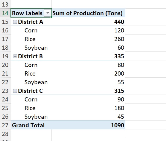
- The total production of Rice in Kecamatan A (150 + 110 = 260 Tons).
- The total production of all commodities per region.
- The grand total of agricultural output across all districts.
Step 5: Enhance with “Value Field Settings”
If you want to find the average production instead of the sum, simply:
- Right-click on any value in the table.
- Select Value Field Settings.
- Choose Average and click OK.
Conclusion
Using Pivot Tables transforms raw agricultural data into actionable insights. This method is highly recommended for researchers who need to provide data-driven justifications in their publications. By utilizing this feature, you ensure that your analysis is accurate, scalable, and professional.
Ready to take your data analysis to the next level? Stay tuned to Kanda Data for more tutorials on statistics and econometrics!