Blog
How to Analyze Pearson Correlation Using Excel

Correlation analysis is one of the analytical techniques used to test the associative relationship between variables. In correlation analysis, testing can be conducted to answer whether the relationship between variables is significant and how strong and the sign of the relationship between the variables.
The strength of the relationship in correlation analysis can be observed through the correlation coefficient. The correlation coefficient ranges from 0 to 1. If the value of the correlation coefficient approaches 1, it indicates a stronger relationship between the tested variables. Conversely, if it approaches zero, it indicates a weaker relationship between the variables.
One of the correlation analyses commonly used by researchers is Pearson correlation. Pearson correlation is used to determine whether there is a relationship between two variables. Therefore, in Pearson correlation analysis, it is necessary to conduct an analysis for each pair of variables being tested (partial correlation).
Excel is an office application that is widely used and familiar to many people. Pearson correlation analysis can also be effectively performed using Excel. In this tutorial, Kanda Data will provide a step-by-step guide on how to analyze Pearson correlation using Excel.
Assumptions of Pearson Correlation Analysis
When researchers choose to use Pearson correlation analysis, it is important to consider the assumptions in order to obtain unbiased estimation results. One of the assumptions that researchers need to fulfill when using Pearson correlation is that the data follows a normal distribution.
Therefore, researchers need to test the normality of the data for the variables being tested. For instance, researchers can use the Kolmogorov-Smirnov test or the Shapiro-Wilk test to ensure that the data from the tested variables are normally distributed.
Another assumption is that the variables are measured on an interval or ratio scale. This is because data measured on interval and ratio scales have a greater potential to meet the assumption of a normal distribution. However, it is possible that the data may not be normally distributed even when using these measurement scales.
If these assumptions are not met, researchers may consider using correlation tests for non-parametric variables. For example, Spearman’s rank correlation analysis can be used for ordinal scale data, and the chi-square test can be used for nominal scale data.
In Pearson correlation analysis, the correlation coefficient can have a positive or negative value. A positive correlation coefficient indicates a positive relationship, while a negative correlation coefficient indicates an inverse relationship.
Example case study of Pearson correlation research
As an exercise to understand how to analyze Pearson correlation using Excel, I will provide an example case study on the relationship between sales, costs, and marketing staff. The research objective is to determine whether there is a significant relationship between operational costs and sales, as well as whether there is a significant relationship between the number of marketing staff and sales.
The researcher collected data from 15 stores in the ABC region. The data for the three variables are on a ratio scale, and after conducting a normality test, it was determined that the data follows a normal distribution. The detailed data collected by the researcher can be seen in the table below:

The steps to perform Pearson correlation analysis in Excel
To conduct Pearson correlation analysis in Excel, the first step is to click on “Data,” and then in the top right corner, you will find the “Data Analysis” menu. If the Data Analysis menu is not visible in your Excel, please activate it by following the tutorial at this LINK.
Next, after clicking on Data Analysis, several analysis tools provided by Excel will appear. You just need to select “Correlation,” as shown in the image below:
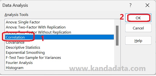
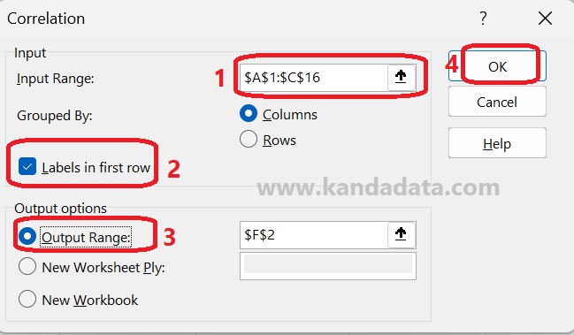
Based on the image above, the next step is to click “OK” until the Correlation window appears. The first step is to input the data. Even though this is a partial correlation, the data input can still be done simultaneously for all three variables.
To do this, click the arrow in the input range box, then copy all the data in Excel, including the labels. After that, remember to check the “Label in First Row” option. Regarding the storage options for the analysis results, you can choose to store them in the same Excel sheet, a different Excel sheet, or a new Excel file. In this tutorial, I will save them in the same Excel sheet, as shown in detail in the image below:
Interpretation of the analysis results
After completing all the analysis steps, the next step is to click “OK,” and the output of the analysis results will appear as shown in the image below:

Based on the above image, we can see that there are three correlation coefficients resulting from the Pearson correlation analysis. The correlation coefficients are as follows: (a) the correlation coefficient between costs and sales is 0.94329, (b) the correlation between marketing and sales has a coefficient of 0.90570, and (c) the correlation between costs and marketing is 0.85045.
In line with the research objective of examining the relationship between costs and sales and the relationship between marketing and sales, we will focus on the correlation coefficients (a) and (b). Based on the analysis results, both of these correlation coefficients show a positive relationship, indicated by their positive values.
Furthermore, the magnitude of the correlation coefficients indicates that both relationships are very strong, as the correlation coefficient values approach 1. To determine whether the relationships are significant or not, we can use two methods: comparing the correlation coefficient values with the R table or finding the p-value (which will be discussed in the next tutorial article). In essence, if the correlation coefficient is greater than the R table value or if the p-value of the correlation coefficient is less than 0.05, it concluded a significant relationship.
Conclusion
Based on the above discussion, we can draw the following conclusions. Pearson correlation analysis can be conducted under the assumption that the data follows a normal distribution and the measurement scale of the data is interval or ratio.
Furthermore, when performing correlation analysis using Excel, we can observe the magnitude of the correlation coefficients and the direction of the relationships. However, to determine the significance of the relationships, additional steps are required, such as comparing the values with the R table or calculating the p-value of the correlation coefficients.
This concludes the article that I can share on this occasion. Hopefully, it has been beneficial and has provided additional knowledge for all of us. Stay tuned for the next article update from Kanda Data next week. Thank you.