Blog
The Best Guide for Optimizing Data Analysis in Excel

In addition to understanding the research topic, researchers also need basic data analysis knowledge. Excel is one of the tools often used by researchers to analyze research data. Researchers can use excel for various data analyses. On this occasion, Kanda Data will write the best guide for optimizing data analysis in excel.
Kanda Data, on this occasion, will write six guides for optimizing data analysis in excel, namely:
1. Excel can be used to perform manual linear regression calculations and test assumptions
Data analysis using statistical software refers to the theory and calculation formulas manually. As a researcher who has a sense of “curiosity”, you should not only input data, analyze it with statistical software, and then interpret the results. But it is also necessary to understand the origin of the calculation method.
The provision of manual calculation skills for students completing their final assignments is excellent. The ability to perform calculations manually needs to be trained from an early age. Students learning to feel like being a researcher will have sufficient provisions. Students with a research spirit will certainly have added value when they enter the job.
Calculator users who have experienced fatigue in calculating have the opportunity to make errors in inputting data. Using excel to help us calculate manually is better than using a calculator. Manual calculations for small data can still be easily handled with a calculator, but for complex data, analysis calculations will require a high level of concentration.
Calculator usage is different from excel, which has several advantages, namely: (a) being able to perform calculations using excel formulas that have the same function as a calculator; (b) calculation operations can be performed on one of the observations, the rest can copy the formula automatically; (c) cross-check can be done if you make an error in data or formula input; (d) formulas can be saved in excel files and can be used whenever needed; and (e) an analytical calculation template can be made to be used in observing data from other research results.
2. Optimizing excel for descriptive statistical analysis supporting the primary analysis
Descriptive statistical analysis is needed to complete the primary analysis. From descriptive analysis, useful information can be obtained to support the results and discussion in research reports or even scientific articles published in national and international journals. Excel can be used for the descriptive statistical analysis of research data.
The descriptive statistical analysis facility in excel can display statistical results, including the average value, median value, mode value, minimum and maximum value, largest value, smallest value and sum. As for the results of other descriptive statistical analyses, namely standard error, standard deviation, sample variance, kurtosis, skewness and range value.
Excel is easy for descriptive statistical analysis, even with many observations (n). So, descriptive statistical analysis in excel can be used to support linear regression analysis on cross-section and time series data.
3. Excel to present an informative table of linear regression analysis results
Excel can also be optimized to help create tables for the publication of data analysis results. Although tables can be created using Ms Word, tables created using Excel have several advantages.
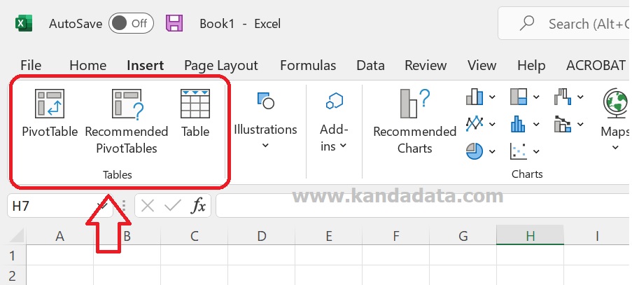
The advantages of Excel that are not found in Ms Word are: (a) Excel has a pivot table menu facility that can be used to help create informative tables from raw data; (b) Descriptive statistical operations in the form of sum, average, minimum value and maximum value can be easily created and added to the recap table of data analysis results in Excel; and (c) Tables in Excel can be easily copied and pasted into Ms Word documents. The menu provided by Excel to help create a table can be seen in the following figure:
4. Excel optimization for interactive and informative graphic presentation in its interface
The results of data analysis can be more informative and interactive if presented in graphs or diagrams. Excel can be used to help create charts with a good interface. Researchers can use it according to the characteristics of the data and what information will be conveyed to the reader. There are many choices of chart types provided by Excel.
Even if the data has been inputted in Excel, there will be a choice of chart recommendations according to the characteristics of the data that has been inputted, as shown in the following figure:
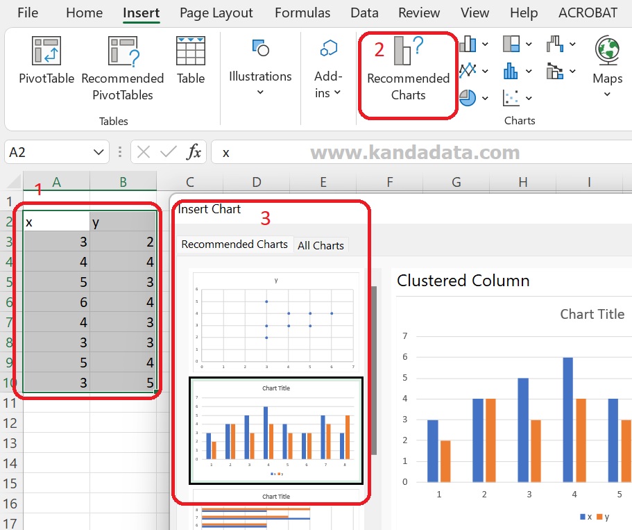
Furthermore, if you choose the insert table manually, the researcher will be faced with various chart types that can be used. The types of graphs that can be created with excel are graphs/column diagrams, line charts, pie charts, bar charts, area diagrams, scatter plots, maps, stock diagrams, surface diagrams, radar, treemap, sunburst, histogram, box and whisker, waterfall diagrams, funnel diagrams, and combo charts.
Researchers can also adjust the selected graph’s appearance based on this choice of diagrams, whether in two or three dimensions. Thus, it shows that Excel can be used to help researchers work in creating interactive and informative charts in the interface.
5. Optimization of data filters in excel to help input research data
One of the other advantages of data analysis is the availability of data filter features in Excel. Many benefits can be obtained by using this data filter, including (a) can sort data alphabetically A-Z or vice versa Z-A; (b) being able to rank data values with the largest-smallest value or vice versa; (c) If the data is sorted for one variable, then several other variables will follow automatically.
Activation of data filters can be done quickly in Excel. The first step that needs to be done is to block the name of the variable that has been inputted, then click data. The last step is to activate the “Filter” in the “Sort & Filter”. The active data filter feature can be seen in each variable name, and a dropdown arrow will appear. Several options will filter the data if the arrow is clicked.
Furthermore, by utilizing the data filter feature, it can be done to help sort the data according to the needs of data analysis. This feature can work well, even if there are more than thousands of observations or data samples.
6. Utilize the excel formulas needed for linear regression analysis and test assumptions
Knowledge of basic excel formulas is important for researchers, so they do not encounter obstacles when analyzing data. Optimization of basic formulas that support data analysis needs to be mastered. Some important formulas that need to be optimized in Excel are:
a. Formula to find the value of the sum of data: =SUM(number1;number2; …)
b. formula to find the average value of a number of data: =AVERAGE(number1;number2; …)
c. Formula to find the largest value: =MAX(number1;number2; …)
d. Formula to find the smallest data value: =MIN(number1;number2; …)
e. Formula to count the number of data items: =COUNT(value1;value2;…)
f. Formula to test certain conditions based on inputted data: =IF(logical_test;[value_if_true];[value_if_false])
g. Use the absolute ($) function to lock cells in formulas in excel.
The basic formula described above is a basic formula that will usually be used frequently in performing data analysis using Excel. If doing data analysis by doing calculations manually, this basic formula will usually always be needed to perform calculations. Therefore, the researchers need to optimize the knowledge of the basic formulas in Excel. That’s what I can write for you. Hopefully useful for all of you. Wait for the article update next week!